You can add an introductory larger size text to your articles by simply wrapping a paragraph in a p tag with the CSS class of “intro”. Put simply, larger text will usually be read before smaller text.
We paid a lot of attention to getting the basics of our typography right in the new WordPress Blog theme. The purpose of this page is to help determine what default settings are with CSS and to make sure that all possible elements are included. For example we looked at headings. Lovely headings.
Heading Two Formatting
Dropcap can be added by wrapping the first letter of the first word in a span tag with the CSS class of “dropcap”. Instead of using the body text font, we use the display font from our titles. This also ties the two elements together if the display font works well with the body text.openers.
We’ve considered the needs of cooks that want to start their recipe journal, so we are styled the recipe format in such way that it beautifully displays the preparation steps.
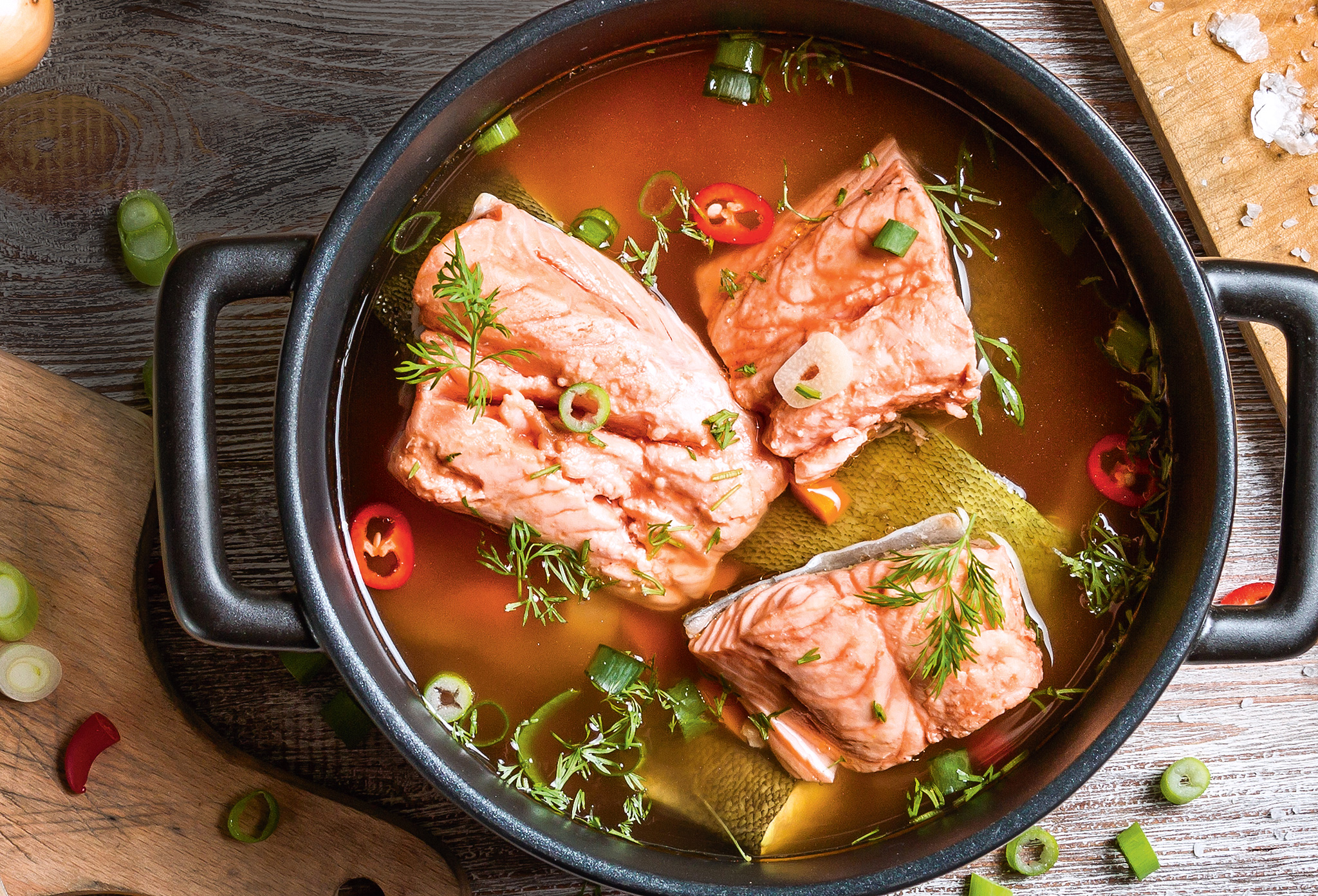
Pumpkin Pancakes with Apple Compote and Candied Nuts
Put your recipe here. Tip: use ordered and unordered lists, headings, images, and links to improve the look of your recipe. You can also use special tags to format notes, ingredients, and directions.
Ингредиенты
- 1 cup raw shelled nuts
- 1/4 cup light brown sugar
- 2 tablespoons unsalted butter
- 2 teaspoons rosemary
- 1 teaspoon flake sea salt
- 1/2 teaspoon chili flakes
Приготовление
- Line a baking sheet with parchment paper and set it aside.
- Melt the butter over medium high heat in a large frying pan. Add the brown sugar and stir to combine.
- Continue cooking until the sugar melts, about 3 to 5 minutes, stirring every minute.
- Add the nuts and cook until they are toasted and very fragrant, about 8 minutes, stirring every minute.
- If the pan begins smoking, remove it from the heat and stir it until it stops smoking, then place it back over the heat and continue stirring every minute until the nuts are sufficiently toasted.
- Empty the pan contents onto the parchment paper-lined baking sheet and spread the nuts mixture out evenly using a spatula. Immediately sprinkle with the rosemary, salt, and chili. Allow to cool to room temperature.
- Once cooled, break apart any large chunks of nuts into individual nuts and serve.
Tips & Tricks: And the whipped cream rounded out all the flavors and just added a nice and fluffy element to the dish. YUM. I got all my ingredients at New Seasons Market, which is a store local to the Pacific Northwest area that sells a huge array of delicious seasonal fresh produce and all-natural ingredients. You can see if there’s a store near you using their find-a-store locator here.
Heading Three
You can also use a purely decorative font. There are thousands of decorative typefaces, and most of them aren’t appropriate for use in a book’s body text.
Blockquotes are a great way to display and format quotations. Insert beautiful quotes using the “quote” button from the visual editor. To add an author just wrap its name in a cite tag.
Tables are useful for layouts where text needs to be positioned side-by-side or floating at specific locations on the page. If making these is frustrating with the usual layout tools, try using a table.
| Type | Font | Description |
| Humanist | Sabon | Closely connected to calligraphy |
| Transitional | Baskerville | More abstract and less organic |
| Modern | Bodoni | Note the thin, straight serifs |
| Slab Serif | Clarendon | Egyptian typefaces have heavy serifs |
To highlight a text, you simply need to wrap it into a <span> with the class “highlight”. This can be done in the Text editor view.
Heading four
[row cols_nr=»2″][col size=»6″]
To split the text in a two columns layout you can use our Gridable plugin. Having multiple columns allows for a very versatile ad grid, and, traditionally, newspapers were in the business of selling ads.babies in slings around front.There is a general rule that one line of unjustified text should have around 9-12 words. For justified text these numbers are around 10-15 words. Since some words are longer and some shorter this is not a perfect measurement.
[/col][col size=»6″]
Small columns of text are easier to read than large ones. Imagine a newspaper sized line that stretched across an entire page. It would be very easy to skip a line. For justified text these numbers are around 10-15 words. Since some words are longer and some shorter this is not a perfect measurements. You must ask yourself how to easily achieve these numbers? Don’t worry it is easy, you won’t have to count the characters one by one.
[/col][/row]
Image Styles
Welcome to image alignment! The best way to demonstrate the ebb and flow of the various image positioning options is to nestle them snuggly among an ocean of words. Grab a paddle and let’s get started.

The rest of this paragraph is filler for the sake of seeing the text wrap around a right aligned image.
As you can see there should be some space above, below, and to the left of the image. The text should not be creeping on the image. Creeping is just not right. Images need breathing room too. Let them speak like you words.
As you can see there should be some space above, below, and to the left of the image. The text should not be creeping on the image. Creeping is just not right. Images need breathing room too. Let them speak like you words.
Let them do their jobs without any hassle from the text. In about one more sentence here, we’ll see that the text moves from the right of the image down below the image in seamless transition.
Don’t let anyone else tell you differently. In just a bit here, you should see the text start to wrap below the left aligned image and settle in nicely. There should still be plenty of room and everything should be sitting pretty. Yeah… Just like that. It never felt so good to be right.
Let them do their jobs without any hassle from the text. In about one more sentence here, we’ll see that the text moves from the right of the image down below the image in seamless transition.
And now we’re going to shift things to the left align. Again, there should be plenty of room above, below, and to the right of the image. Just look at him there… Hey guy! Way to rock that left side. I don’t care what the right aligned image says, you look great. Don’t let anyone else tell you differently. In just a bit here, you should see the text start to wrap below the left aligned image and settle in nicely. There should still be plenty of room and everything should be sitting pretty. Yeah… Just like that. It never felt so good to be right.
And that’s a wrap, yo! You survived the tumultuous waters of alignment. In just a bit here, you should see the text start to wrap below the right aligned image and settle in nicely. There should still be plenty of room and everything should be sitting pretty.